Help with CSS

Status
Not open for further replies.

trilogy33

OMG Member
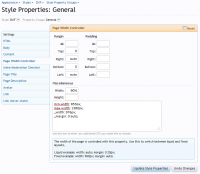
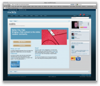
Does anyone mind me whacking up my CSS for my proposed Extra About page here?
It's almost complete and looks ok at full width but breaks when the window is resized horizontally.
Tried the "clear: both" method but I'm missing something as it doesn't seem to be working on tests. :oops:
 

trilogy33

OMG Member
I think I'm about there :)
Technically, I was trying to do the impossible, I'm quite good at that! The design is/was quite wide and trying to put a three box design into a, what basically should have been a two box maximum was just beyond the limitations of the screen. Looks ok at a generic 1680 x 1050 res. but of course not everyone is viewing at those dimensions.

Looking back at it now, a three box design is fine if all three were to contain, for example, text. Mine's two text boxes and one fixed image rotator. Given that, if you try to resize the screen horizontally, "something" has to give; the text has to go somewhere and trying to shove an immovable object "the rotator" into a bunch of text is just bound to go wrong on so many levels. :D

I tweaked it more a little last night and I'll pop back later on and post up, with the improved html & css.
Yay! I almost fixed something.
 

Floris

I'm just me :) Hi.
Staff member
Jan 1, 2001
60,101
1,425
930
47
Netherlands
mrfloris.com
Maybe set min-width: 720px; /* when page is smaller the image wont leak over the title */
 

Attachments

  • Screen shot 2011-09-11 at 7.14.26 PM.png
    Screen shot 2011-09-11 at 7.14.26 PM.png
    432.6 KB · Views: 3
  • Screen shot 2011-09-11 at 7.14.21 PM.png
    Screen shot 2011-09-11 at 7.14.21 PM.png
    475.3 KB · Views: 3

trilogy33

OMG Member
Firebug was playing up earlier, not letting me edit on the fly.
So grabbed the template and it worked, sort of...

Using this browser resolution checker, there's some weirdness at 1024 x 768. I'm sure that's the (lowest res. the styles in XenForo support anyway?): http://www.markhorrell.com/tools/browser.html
Still a bit wonky at the top right corner.

dxf_oops.png

A bit more tweaking and I think I'll have it sorted :)
 

trilogy33

OMG Member
I think I'm just trying to cram too much in to be honest.
Plus the DXF style has some percentage attributes in pageWidth controller...

dxf_pwcontroller.png

Don't get me started on Flexile (lol) - this could be a long night.
Interesting lesson though and always handy to know, could help others, which of course I'd be glad to help.
[cough]gotta learn it myself first[/cough] :P

Updated CSS and unchanged* html (*possibly) attached for your perusal.
 

Attachments

  • dxf_pwcontroller.png
    dxf_pwcontroller.png
    37.3 KB · Views: 0
  • html.txt
    3.7 KB · Views: 0
  • updated CSS.txt
    1.7 KB · Views: 0

trilogy33

OMG Member
^ Note to self. If submitting CSS for evaluation, then the Default Style CSS and html are the best bet. Not everyone has the Flexile Style / DXF style. :oops:

If you check now, you'll see that it is 99.9% perfect! Yay!
The 0.01% is that is doesn't render properly on an iPhone. Margin?

iphone_margin.png
 

trilogy33

OMG Member
No worries. It be fixored now :)
Each style has its own quirks. Flexile and Flexile Dark has a way smaller area to work with, so me trying to throw everything in there was just bound to go wrong ;)
Had to compromise with these and throw the image rotator down to the base but at least now, each style can reference its own set of pictures instead of a single list. So that's good! :D
 
Status
Not open for further replies.